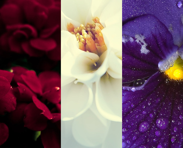
Opaline is a Health & Beauty clinic company with Aromatherapy and medicinal plant treatment. So the Opaline Logo design I created has organic curves like the flowers. I also play with the symmetry of the form of the flowers to project equilibrium and balance.
Colorful Vibrance
SPIRITUAL PEACE
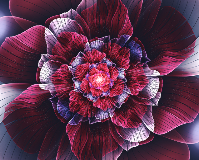
Color is always determinant on a logotype, in this occasion, the client was inclined towards bourdeaux, white and violet colors. I made a color composition of violets & white outlines to project purity, cleanness, spirituality, and luxury throughout the logo’s emblem.
Pure Equilibrium
ORIENTAL INSPIRATION
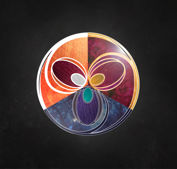
The opaline logo follows a symmetrical design, the inspiration was born from the Yin & Yang symbol, in which each side represents a different, opposite, but complementary at the same time among them. Opaline’s concept logo reflects harmony, nature & health in which are elements that define the brand as its best.
Vibrant Outcome
ALLURING ESSENCE
The conclusive result is a resplendent corporate image that enhances the concept & meaning of Opaline as a splendid health company.